How to add icons and buttons to links
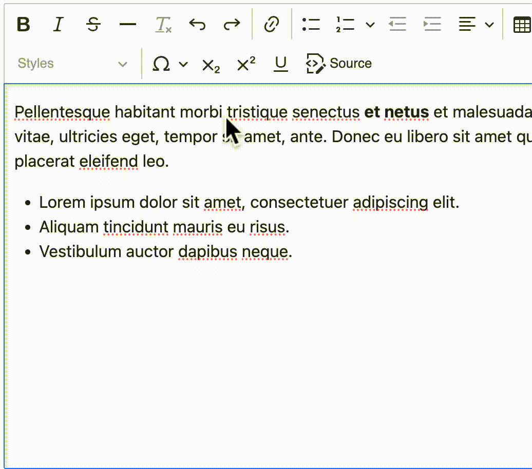
Content editors adding content through the rich text editor can configure how links display using the interface shown below. Access this interface through the following steps:
Highlight text in the rich text editor
Click the “Link” icon in the toolbar.
Select one or more link options.
Primary button: Display the link as a burnt orange button. Appropriate when the destination website is a form or other interactive tool.
Secondary button: Display the link as a white button with a burnt orange border. Appropriate when the destination website is a form or other interactive tool.
Authentication required icon: Indicate that a visitor must authenticate to access information at the link destination
External link icon: Indicate that the link leads to a different website. Choosing this will not automatically cause the link to open in a new window. See below.
Right-facing caret: This does not have an explicit meaning; it is largely decorative.
Open in new tab: Cause the link to open in a new window/tab, rather than replacing the existing tab. This may be appropriate for external websites. Choosing this will not automatically add the “external link” icon, above.
Mutually-conflicting styles
This interface allows adding multiple link behaviors simultaneously. It is the responsibility of the content editor to ensure that multiple selected options are semantically correct. For example, a content editor should not choose the “Primary button” and “Secondary button” style together.