Managing page region content
Speedway theme documentation
This page describes page regions defined by the “Speedway” theme, the default theme as of 2026. Some content below will not be accurate for sites still using the legacy “Forty Acres” and sites with heavily customized sub-themes.
Most of the time when content editors are creating and editing pages they are concerned with the interior region of the page: the content directly below the page title. Occasionally, however, content in the header and footer needs to be updated. Toward that end, it is useful to be familiar with the available page “regions,” what content is not editable, what can be added, removed or changed, and how.
Contents
Overview of page regions
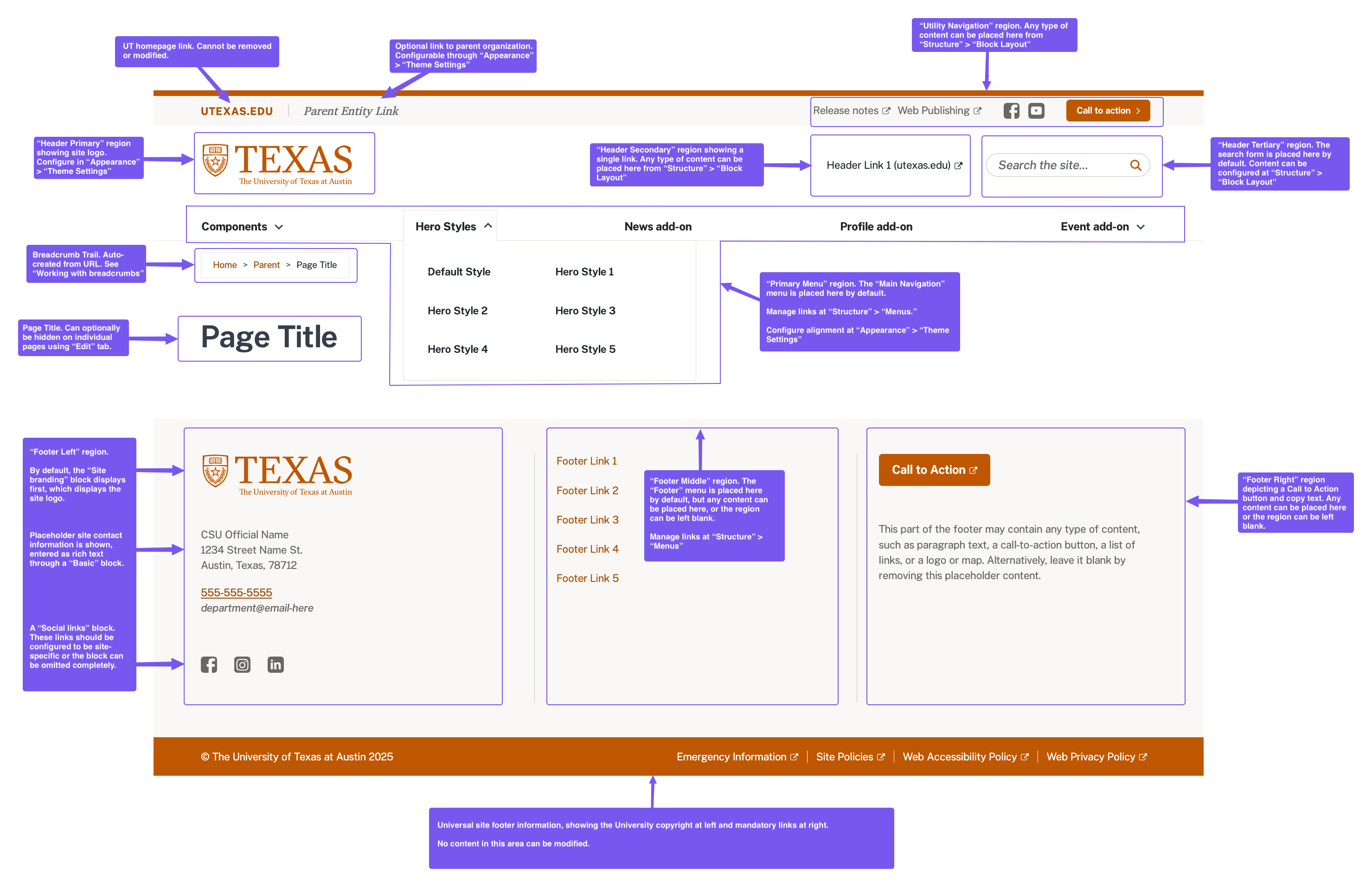
Content recommendations for editable page regions
Utility Navigation: Located in the top right corner, this region is ideal for content external to the site such as links to associated organizations, links to the organization’s social media presence, and call-to-action buttons for things like fundraising campaigns.
Header Primary: This region, located directly below the University wordmark, contains the site logo by default. This logo placement is a web convention and should usually be left as-is.
Header Secondary: Located above the main navigation, this region is appropriate for links that users might look for as “shortcuts” to common tasks, such as support, contact, or sign-in links.
Header Tertiary: Located at the right side of the header, this region includes the site search by default. This location for site search is a web convention and should usually be left as-is.
Primary Menu: Displaying at the bottom of the header, this region is generally reserved for the site’s main navigation menu. See The main menu for recommendations and web conventions.
Footer Left: This region’s default content consists of the site logo, contact information, and social media icons. These items are a good convention but can be modified as appropriate to individual sites.
Footer Middle: A list of site links displays by default in this region. These footer links often serve to support the site’s information architecture. Common architectural patterns include repeating the most important links from the site header, a link to a sitemap or, for sites with many pages, a mini directory of site content.
Footer Right: There are few established conventions about what content should be placed in this part of the footer. Some sites include a “Subscribe” or “Contact” button here or an embedded map to the organization’s physical location.
Quick edit of existing content using “Pencil” icon
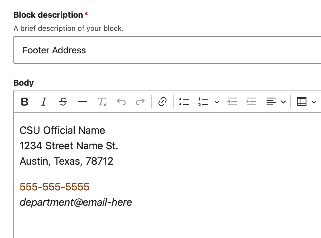
Most elements within the header and footer can be edited using the contextual “Pencil” icon that is revealed upon hovering over content.
The Edit link provides the interface for content edits.
The Configure block link provides an interface for controlling which pages the content should display on and where; this is described in more depth below.
Contextual “Pencil” icon |
Rich-text editing interface |
|---|---|
|
|
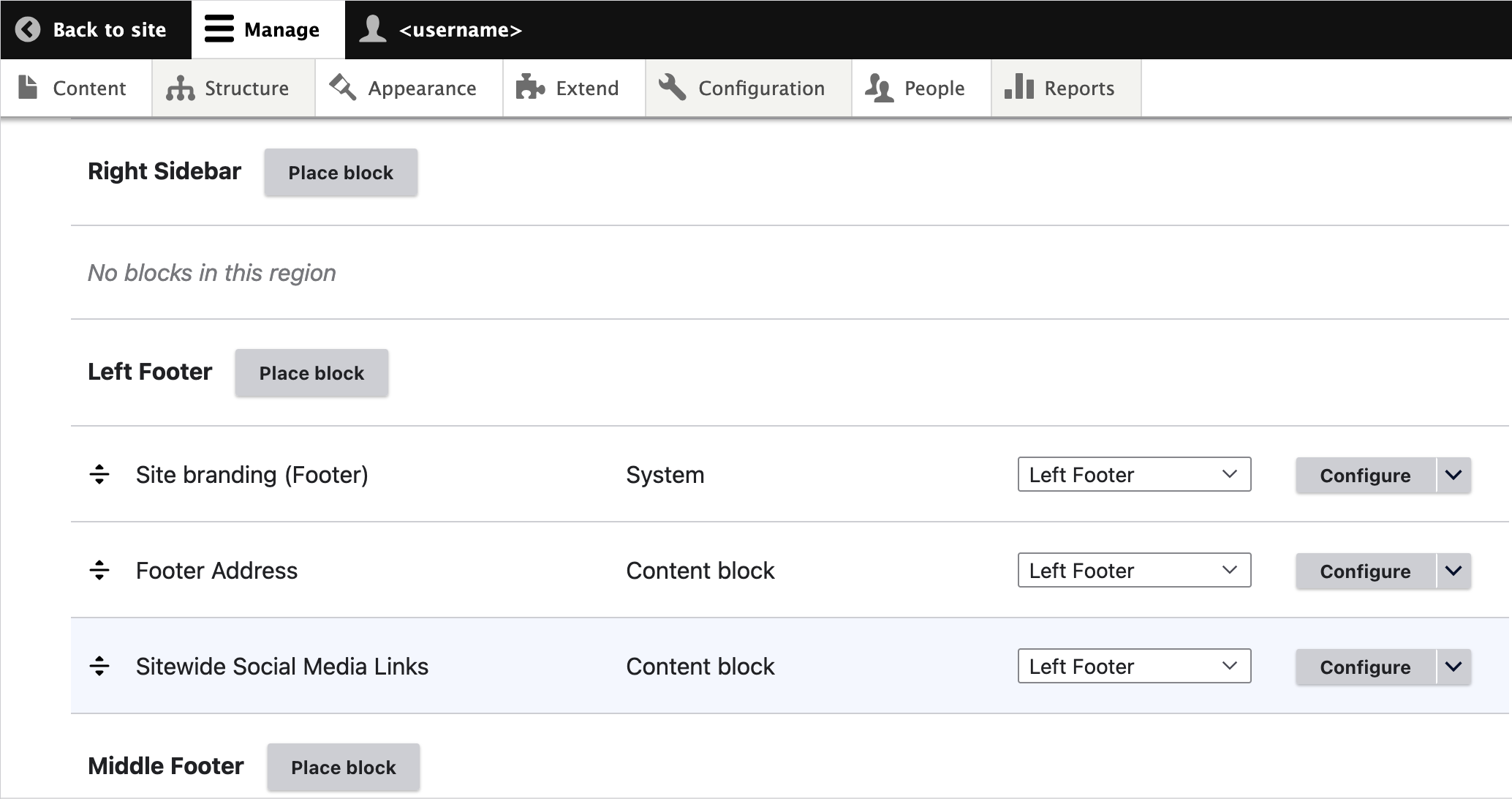
Manage content region placement and page assignment
To control what content displays and in what regions, go to Structure > Block layout (/admin/structure/block). This page displays all content assigned in each region.
Use the “Place block” button to add new content to any region.
Use the “Configure” button to define rules for which pages the content should display on.
Use the drag-and-drop icons to rearrange the order of contents in a region.
Note
For more detail on the capabilities of this interface, see https://www.drupal.org/docs/core-modules-and-themes/core-modules/block-module/managing-blocks.