Adding content blocks
The Drupal Kit includes templated content “blocks” for placement within page layout. After saving a Flex Page, click Layout > Add block > Create content block to access the list of available block types.
Contents
Available block types
Note
Developers: under the hood, most block types are custom compound field types. The can be re-used as standalone fields on content types.
Call To Action
The Call-to-Action (CTA) provides a standalone button with custom text that prompts the user to use the link. This text is typically written as a command or action phrase linking it to anything with a URL (on your site or an external site). This could be a web page, an event, a document, a contact form, etc.

The Call to Action
Featured Highlight
The Featured Highlight is for high profile callouts, and can link to other content.
It includes an image, headline, copy text, date (formatted in Associated Press (AP) style, e.g., Dec. 16, 2018), and call-to-action link. The call-to-action URL may be a page on the site, or an external link, and if provided, the headline will also link to that destination.
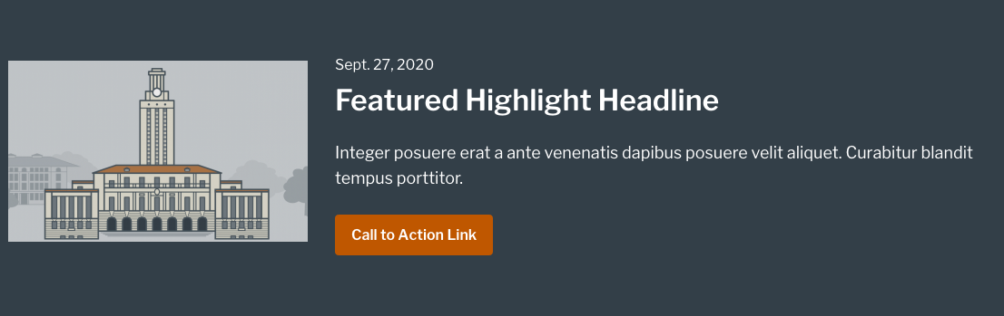
The Featured Highlight
Display options
The Featured Highlight has display options including setting a background color (with appropriate text color). Available background colors are Bluebonnet (Medium), Charcoal (Dark), and Limestone (Light).
Flex Content Area
The Flex Content Area, as its name implies, is a highly flexible block that can yield a variety of looks. It includes an image, headline, copy text area, a single call to action link, and list of links. You can add multiple Flex Content Area items on a single page. The image below shows two instances of Flex Content Area, one with a list of links, the other with a “call to action” button.
Flex Content Areas with multiple items can display in 1, 2, 3, or 4 items per row. See Control items per row (multi-item block types) for more detail.
Images can display with or without borders
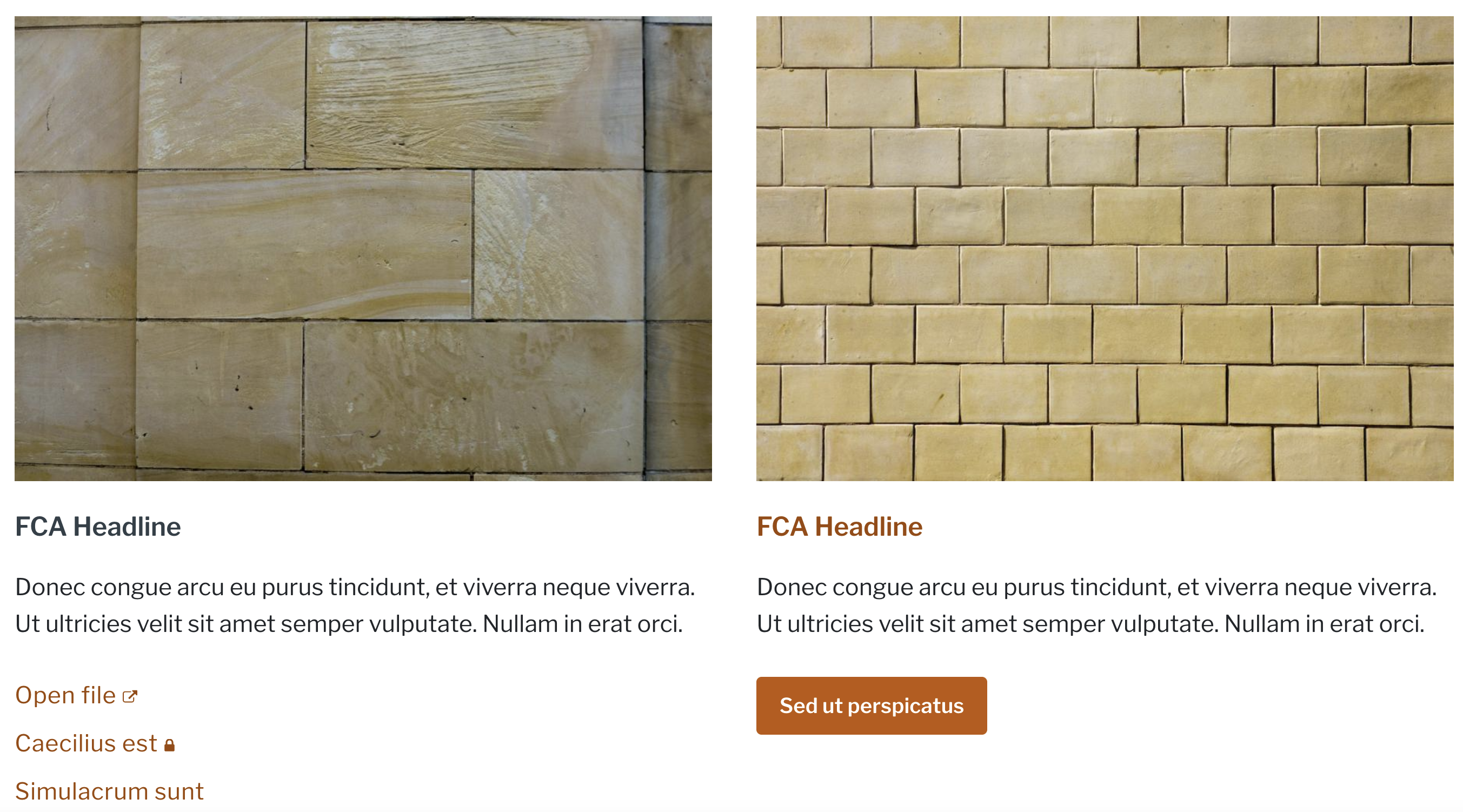
Examples of Flex Content Area, with a list of links (left), and with a “call to action” button (right).
Flex List
The Flex List allows content editors to display multiple instances of header + content pairs. Choose between 3 display variations in the “View mode” dropdown: default list, accordion, and horizontal tabs.
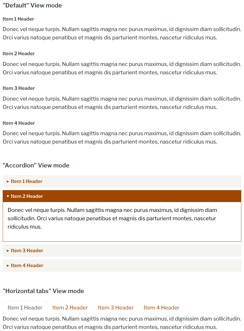
Reorder items using the drag-and-drop editing interface.
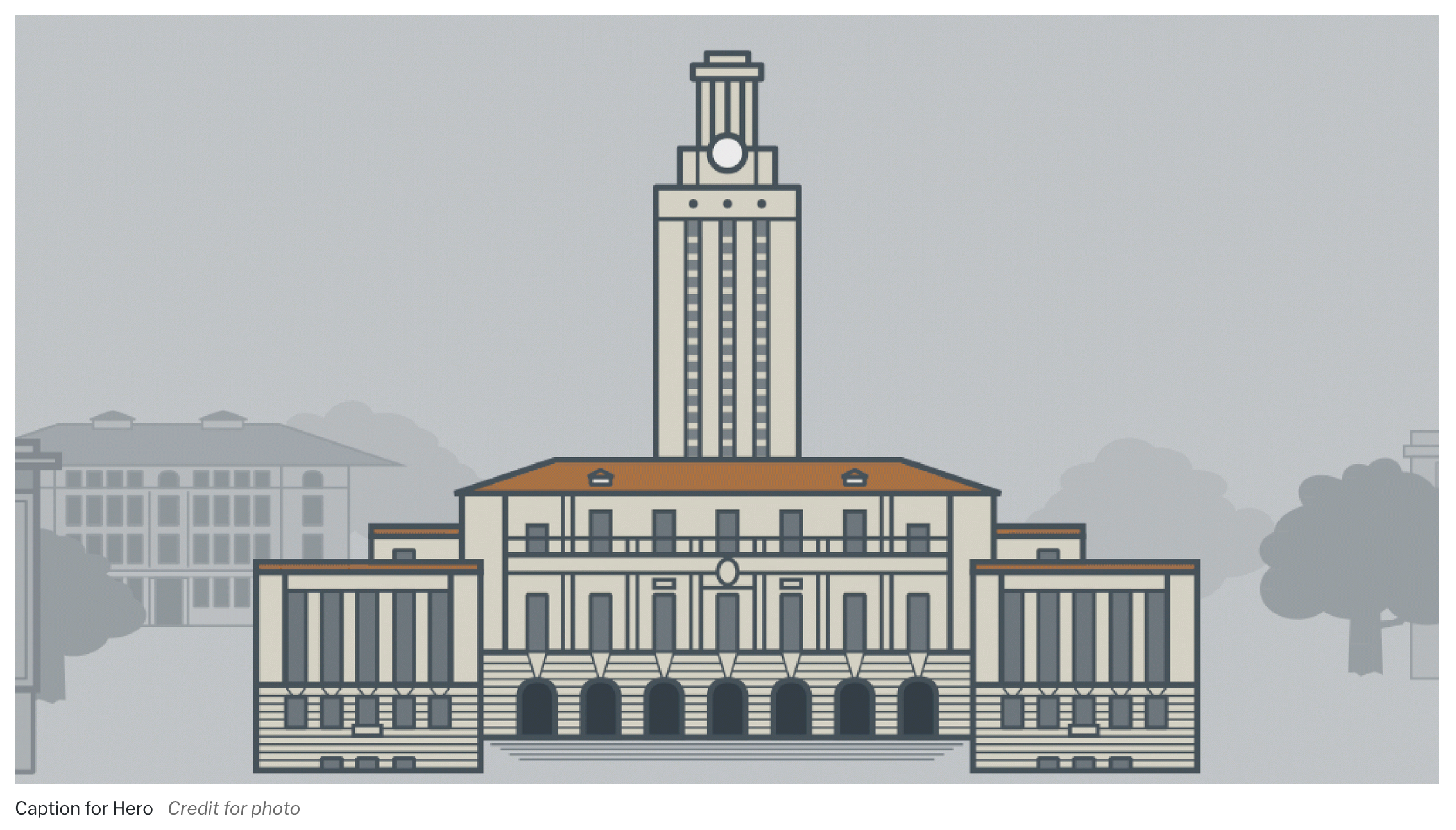
Hero
The Hero is a block consisting of a large image and the following optionally displayed textual fields:
Heading
Subheading
Caption
Credit
Call to Action link – an internal or external link with URL and Link text
The Hero looks best on pages in full-width or near full-width regions, so generally it is best to upload high resolution images (ideally 2280x1232 pixels). The system will deliver smaller image derivatives when viewed on smaller screens.
Change from Drupal Kit version 2
All fields on the Standard Page and Landing Page Hero images now are present in one Hero block.
The Hero Display Styles are 6 selectable options for displaying the Hero layout which vary the placement of the textual fields and the image. Select display options for the Hero in the Layout Builder settings tray (see the Formatter), or on the Custom Blocks configuration page (see the view mode).
Default: Large media with optional caption and credit line |
|
Style 1: Bold heading & subheading on burnt orange background, floated right |
|
Style 2: Bold heading on dark background, anchored at base of media |
|
Style 3: White bottom pane with heading, subheading and burnt orange call to action |
|
Style 4: Centered image with dark bottom pane containing heading, subheading and call-to-action |
|
Style 5: Medium image, floated right, with large heading, subheading and burnt orange call-to-action |
|


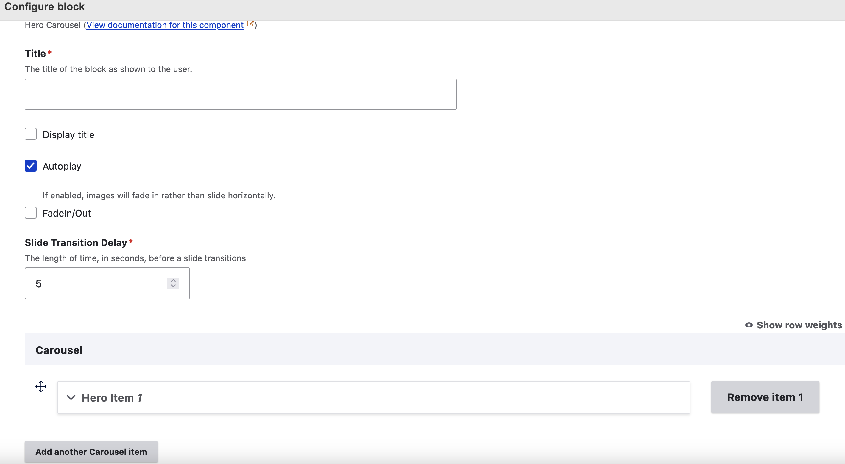
Hero Carousel
The Hero Carousel extends the static Hero block by displaying a rotating photo block in a timed sequence that meets UT Austin’s web accessibility standards.
The two options for transitioning from one image to the next are a sliding effect and a fade-in/out effect. The default is the sliding effect.
A “Slide transition delay” control sets the amount of time the carousel images are stationary before the transition to the next image happens. The default is 5 seconds.
Note
Adjust the slide transition delay if Hero items have text. A good guideline for setting this delay is to aim for 1 second for every 3 words of text.
Currently, the look and feel of the Hero Carousel images matches the same styling as the Hero Style 3 (shown above in the Hero documentation). It displays a centered image with a white bottom pane containing a heading, a subheading and a call-to-action link. The “Caption” and “Credit” fields also show in the configuration when creating a Hero Carousel, but these are not used and will not display to the end user viewing this Hero Carousel style.
In the future, more Hero Carousel styles will be available that match the other Hero styles and will utilize various combinations of all the fields shown in the configuration.
Note
Images in the Hero Carousel and Hero block will not display in the layout preview. This display after pressing “Save layout.”
Carousel navigation
The carousel defaults to autoplay, rotating through images. Users can pause/play movement with the navigation buttons. Users can also pause carousel movement by hovering the cursor over an image.
The dot-like icons under the carousel show the total number of items and also serve as navigation.
Users can change items with stationary arrow buttons on the left and right.
View a demo of the Hero Carousel on the Drupal Kit demo site
Screenshot image showing the Hero Carousel configuration options for autoplay, image transition type, and slide transition speed.
Image Link
The Image Link is a simple block for uploading an image and linking it to a web page or external document.
The Image Link shown in two regions - main and sidebar
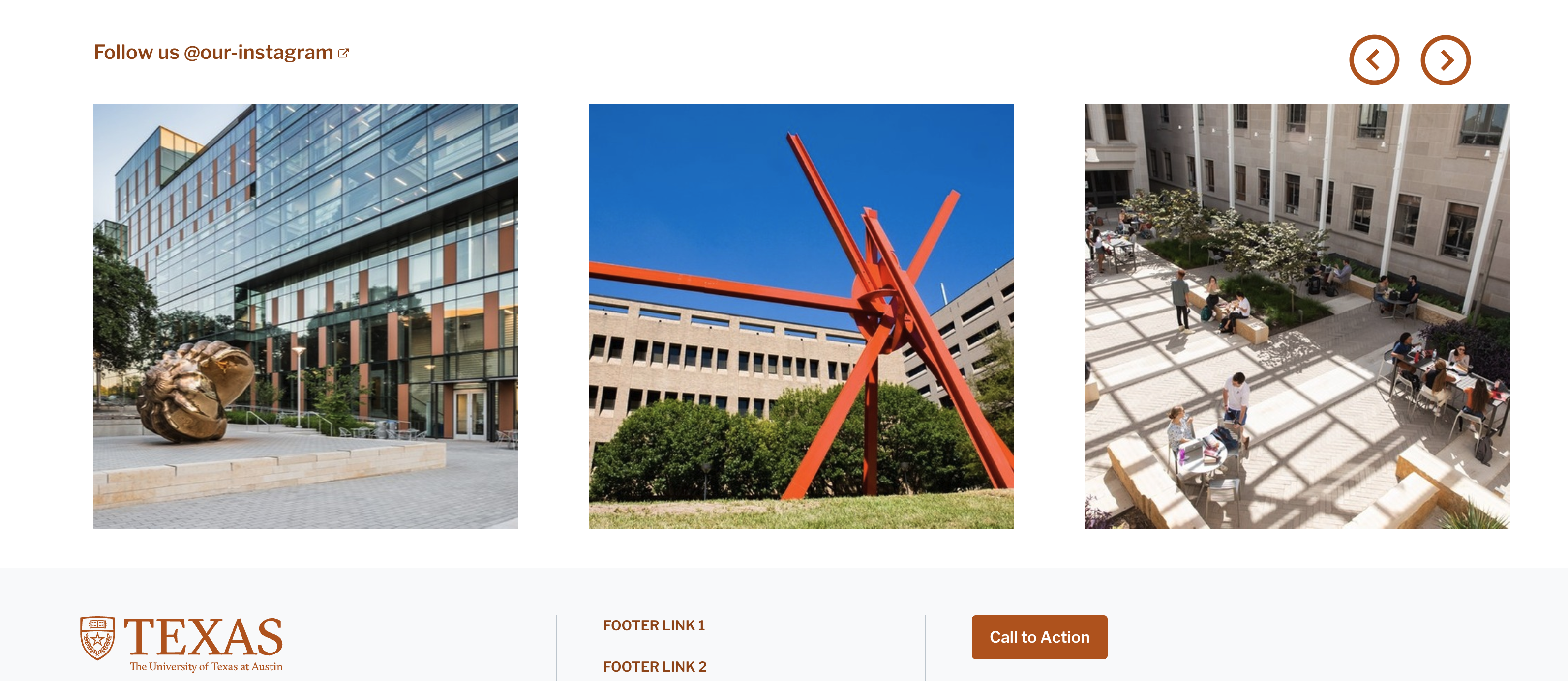
Instagram
The Instagram block provides a scrollable list of posts from any Instagram account. The list will display the nine most recent Instagram posts. On focus/hover, each Instagram displays its description and links to the original content on Instagram.
To set up an Instagram feed, see Integrating external content.
Photo Content Area
The Photo Content Area is similar to the Flex Content Area, and allows for an image with a photo credit, a headline, copy text, and link(s).
The ratio of the image is 3:4. For best results, use an image with those proportions to avoid having the uploaded image cropped.
Images can display with or without borders.
The optional “Credit” displays in italics directly below the image, as shown below.
Text elements display to the right of the photo in wide column widths (see image below) and below the photo in narrow column widths (see image below).
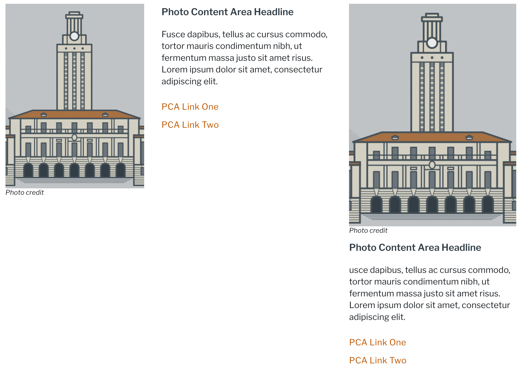
The Photo Content Area displayed in wide column width (left) and narrow column width (right)
Promo Lists
Promo Lists provide the ability to add many content-rich featured items on a page, without taking up much space.
You can add multiple promo list containers to a single page, and each group can have multiple list items.
Lists can display in various combinations:
Choose “Single list full” for a one-column list of items that spans the width of its container (see example below).
Choose “Single list responsive” to produce a two-column list that spans the width of its container.
Choose “Two lists, side-by-side” to produce a one-column list that spans half the width of its container.
The link may be an internal page or external link.
Images display at 85 x 85 pixels.
Images can display with or without borders.
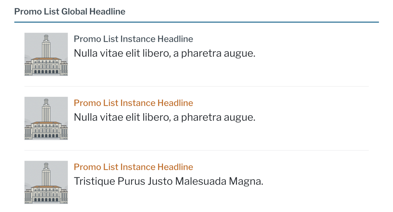
The Promo List
Promo Units
The Promo Unit, similar in content to the Promo List, adds an unlimited number of pre-formatted “units” of content, each of which can contain an image, headline, copy text, and call to action link.
- Images can display as three styles:
Landscape (220x140)
Square (140x140)
Portrait (150x188)
Images can display with or without borders.
Optionally add a headline above all individual Promo Units on a page (as shown below).
Content will default to a horizontal layout when the region width can accommodate it; content editors may set the display explicitly to vertically stacked content.
Promo Units with multiple items can display in 1, 2, 3, or 4 items per row. See Control items per row (multi-item block types) for more detail.
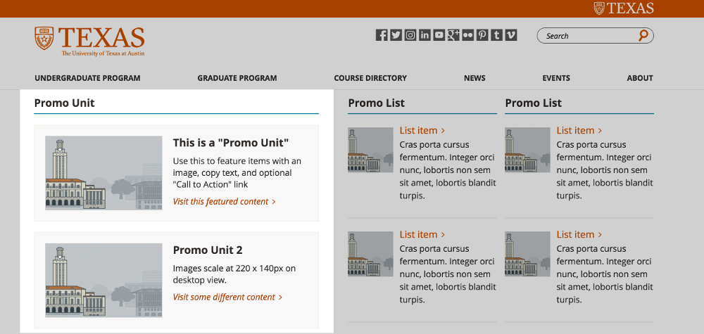
The Promo
Quick Links
The Quick Links block provides the ability to display a headline, copy, and list of one or more links. The headline and copy are optional.
Things to Note
Quick Links can display in 1, 2, 3, or 4 items per row. See Control items per row (multi-item block types) for more detail.
A 3-column Quick Links example
Resources
The Resources block provides an unlimited number of pre-formatted units of content, each of which can contain an image, headline and links. There is no copy field.
Resource collections can display with image adjacent to links (“Default”) or above links (“Stacked”); on some screen widths, Resources will automatically stack to better fit the available space.
Images can display with or without borders.
Resources can also display in 1, 2, 3, or 4 items per row. See Control items per row (multi-item block types) for more detail.
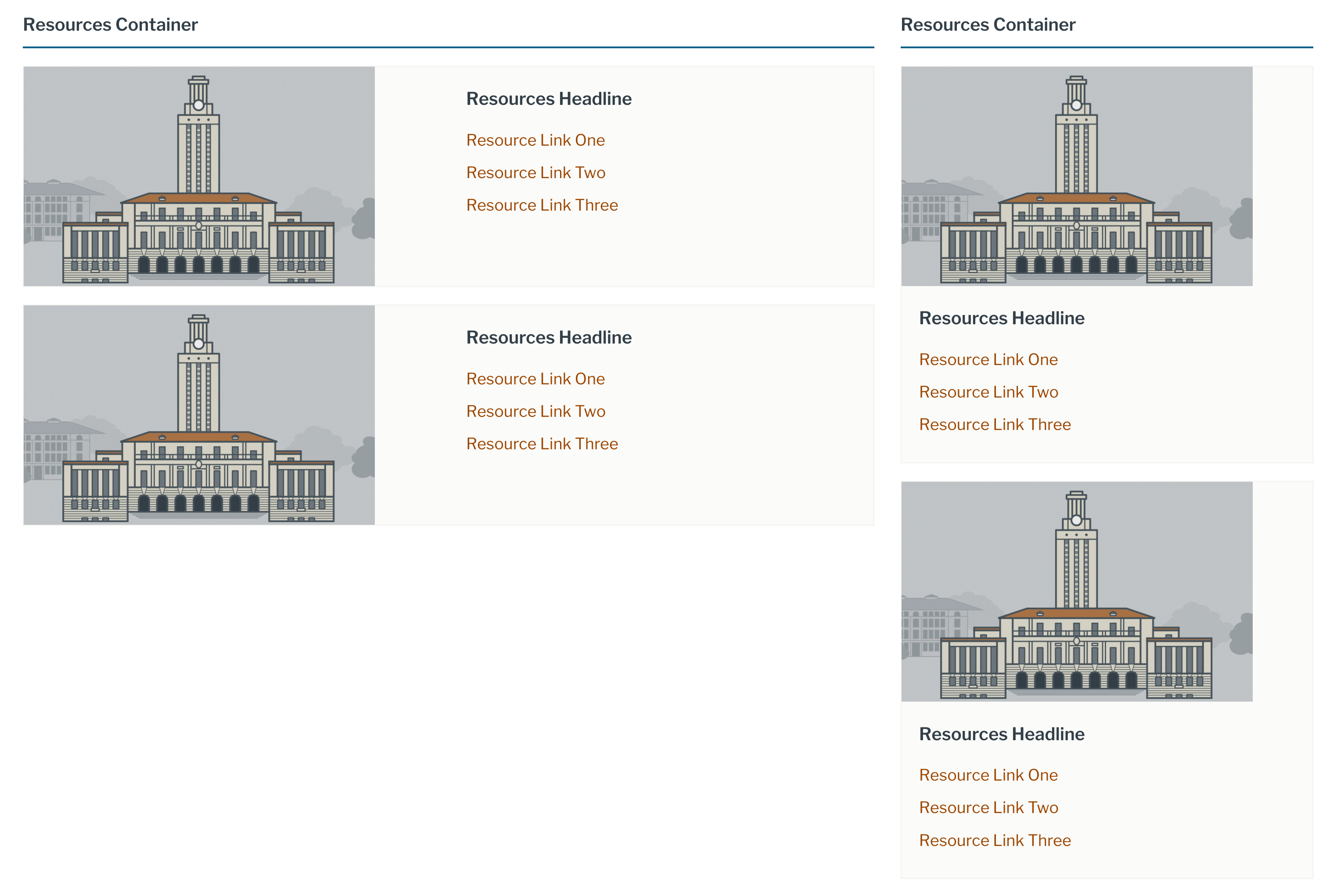
Two Resources blocks - in main region (left, “Default” display), and in a sidebar region or on mobile display (right, “Stacked” display)
Rich text areas (including images)
The easiest way to add open-ended rich text content to a page is via “Basic Block” content. It includes a rich-text toolbar for applying styling to text, and for embedding images or videos. The simplest way to access this interface on a Flex Page is to choose Layout > Add Block > Create content block >Basic Block.
See also
Social Links
The Social Links block provides a way to link to an organization’s social media accounts.
Page-specific or section-specific social links can display to Flex Pages as described in Creating inline blocks.
More commonly, you will use a site-wide set of icons displayed in the header or footer. The Drupal Kit installs with the site-wide Social Media Links. Edit Social Links by hovering over the block, then clicking “Edit” as pictured below, or by navigating to Content > Blocks (
admin/content/block) and editing the “site-wide Social Media Links” block.Tip
Edits to the site-wide Social Media Links (edit page shown below) will affect instances of it everywhere on the site.
Add an item with the “Add social link item” button. Then select from the “Website” dropdown list and include a URL. To remove a social link item, remove the URL. Don’t forget to click the “Save” button.
Note
You can also use custom icons, as described in Social media icons.
Other alternatives for adding social links
The AddToAny module provides a configurable block containing links to social media outlets. Learn more about that on the Social media share links page.